Developer tools
How to check your screen resolution
A game, a video setting or a support form asks for your screen resolution, and the numbers you find do not agree. You will find the real resolution, see why scaling changes it, and read the size of your browser window. It works on any computer, tablet or phone.
Browser zoom changes the pixel ratio too. Press Ctrl + 0 (Cmd + 0 on a Mac) to reset zoom to 100% first.
Open Screen resolutionContents
Reset the browser zoom
Zooming a page in or out changes what the browser reports. Press Ctrl + 0, or Cmd + 0 on a Mac, so zoom is 100%. On a phone, pinch back to normal size.
Open Screen resolution on cv.cm
The large number is your screen resolution in real pixels, such as 1920 × 1080. If it has a common name, like Full HD (1080p) or 4K UHD, that appears in the first row.
Open Screen resolutionUnderstand CSS pixels and scaling
Windows at 125% and Retina screens make text larger by using more real pixels per CSS pixel. Device pixel ratio says how many: a 1920 × 1080 screen at 125% shows 1536 × 864 CSS pixels and a ratio of 1.25.
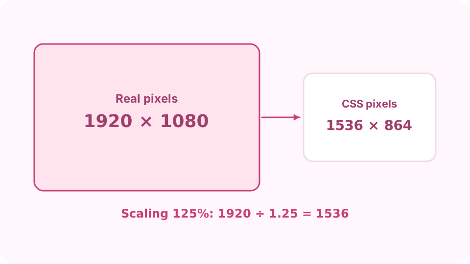
With 125% scaling, 1920 × 1080 real pixels are reported as 1536 × 864 CSS pixels. Read the viewport
Browser viewport is the part of the window that shows the page, in CSS pixels. Resize the window and it changes at once. Web designers use this size for responsive layouts.
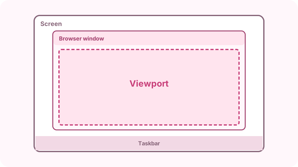
The screen, the space left by the taskbar, and the viewport inside the browser. Check the other details
Available screen leaves out the taskbar or Dock. Aspect ratio gives the shape, such as 16:9 or 16:10; Orientation and Colour depth complete the picture. Turn a phone and the values follow.
Copy the details for support
Copy details copies every row as text. Paste it into a bug report or support chat so the other side sees exactly what your browser sees.
FAQ
How do I find my screen resolution on Windows or Mac?
In Windows, Settings → System → Display shows the same figure as the big number here. On a Mac, System Settings → Displays shows the "looks like" size, which is the CSS size on this page; the big number is the real pixels behind it.
Why does a website say my screen is smaller than it is?
Websites see CSS pixels. With display scaling above 100% there are fewer CSS pixels than real ones. Multiply by the device pixel ratio to get the real resolution.
What resolution is my phone?
Phones have a pixel ratio of 2 to 3 or more, so a phone that reports 390 × 844 CSS pixels at ratio 3 has 1170 × 2532 real pixels.
Is a bigger viewport the same as a bigger screen?
No. The viewport is only the browser window's page area. It is smaller than the screen when the window is not full screen or toolbars take space.
Why don't the values match with two monitors?
The page reads the screen the browser window is on. Move the window to the other monitor and the values update.